
Blog
12 Best Data Visualization Software Platforms in 2026
Businesses generate more data today than ever before. Marketing platforms track customer behavior in real time, ecommerce stores collect sales and inventory insights continuously, SaaS companies monitor product usage daily, and operational teams rely on dashboards to manage workflows across departments. The challenge is no longer collecting information. The real challenge is making that information understandable and useful.
Large spreadsheets and static reports rarely help teams move faster. Raw numbers can quickly become overwhelming, especially when businesses are working across multiple systems and trying to identify patterns, trends, or performance issues quickly. Decision-makers need data presented in a way that is visual, interactive, and easy to interpret.
That is why the demand for the best data visualization software continues to grow across nearly every industry.
Modern visualization platforms help businesses transform complex datasets into dashboards, charts, maps, reports, and interactive analytics environments that simplify reporting and improve decision-making. Instead of manually compiling spreadsheets or waiting for static reports, teams can monitor performance in real time and explore data dynamically through visual interfaces.
The best data visualization platforms now go far beyond basic graphs. Many support advanced dashboard creation, drill-down analytics, interactive filtering, real-time data syncing, embedded reporting, geospatial visualization, and collaborative sharing across organizations. Businesses can visualize marketing campaigns, financial reporting, operational KPIs, customer behavior, inventory systems, and infrastructure performance from centralized dashboards.
Different platforms focus on different needs. Some tools prioritize enterprise-scale business intelligence and advanced analytics, while others focus more heavily on usability, storytelling, or lightweight reporting workflows for smaller teams.
In this guide, we will break down the best data visualization software platforms in 2026, including business intelligence tools, interactive dashboard platforms, chart building software, and reporting solutions for modern organizations. Whether you are analyzing marketing performance, building executive dashboards, monitoring operations, or presenting complex analytics visually, this guide will help you choose the right platform for your business.
Quick Takeaways
- Tableau, Power BI, Looker, and Databricks AI/BI are among the leading data visualization software platforms for enterprise reporting, dashboarding, governance, and scalable analytics ecosystems.
- Power BI is widely preferred by businesses already using Microsoft products because of its affordability, enterprise integrations, and strong dashboard capabilities.
- Tableau remains one of the strongest interactive dashboard tools for advanced analytics, highly customized visualizations, and deep drill-down reporting.
- Looker Studio is one of the most popular free options for marketing dashboards, especially for businesses using Google Analytics, Google Ads, and Search Console.
- Modern data visualization platforms now support real-time dashboards, AI-assisted analytics, interactive filtering, embedded reporting, and collaborative data exploration.
- Businesses increasingly use visualization software to simplify complex datasets into charts, KPI dashboards, geo maps, treemaps, and operational reports that are easier to understand and act on.
- ChatGPT can assist with data analysis and data visualization workflows by helping users interpret datasets, generate charts, summarize analytics, and automate reporting tasks.
- SQL and Tableau serve different purposes. SQL provides deeper control over raw data manipulation, while Tableau focuses on visual analytics and dashboard creation for reporting and business intelligence.
- Open-source platforms such as Grafana, Apache Superset, and Metabase are becoming increasingly popular among technical teams wanting flexible analytics environments with lower licensing costs.
- Real-time reporting has become a major priority because businesses increasingly rely on live operational data instead of manually updated spreadsheets and static reports.
Quick Comparison Table
| Platform | Best For | Free Plan | Starting Price | Standout Feature |
| Tableau | Advanced business intelligence | Limited | Premium | Deep interactive analytics |
| Power BI | Microsoft ecosystem | Yes | Affordable | Enterprise integrations |
| Looker Studio | Google reporting | Yes | Free | Marketing dashboard simplicity |
| Qlik Sense | Associative analytics | Limited | Premium | Dynamic data exploration |
| Domo | Executive dashboards | No | Enterprise pricing | Real-time business visibility |
| Sisense | Embedded analytics | No | Enterprise pricing | Scalable embedded BI |
| Zoho Analytics | SMB reporting | Yes | Affordable | Easy business dashboards |
| Grafana | Operational analytics | Yes | Open-source | Real-time infrastructure data |
| Apache Superset | Open-source BI | Yes | Free | Flexible dashboard building |
| Metabase | Lightweight analytics | Yes | Affordable | Simple team analytics |
| Infogram | Presentation visuals | Yes | Affordable | Visual storytelling |
| Flourish | Interactive visual content | Yes | Flexible pricing | Advanced visual storytelling |
Why Data Visualization Matters More Than Ever
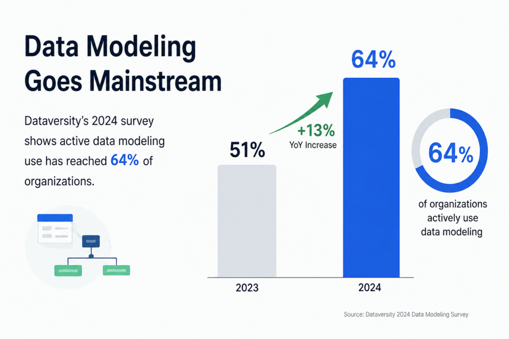
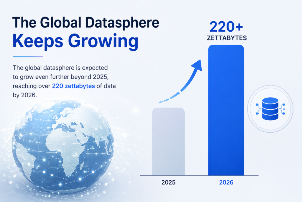
Source: Dataversity: The trend in data modeling in 2025.
Businesses make decisions faster today than ever before.
Marketing teams monitor campaign performance daily. Ecommerce operators track inventory and revenue in real time. SaaS companies analyze churn, retention, feature usage, and customer engagement continuously. Financial teams monitor forecasting, profitability, and operational costs across multiple systems simultaneously.
The problem is that raw data alone is difficult to interpret quickly.
Large spreadsheets, disconnected reports, and static exports often create more confusion rather than clarity. Teams waste time manually compiling reports instead of identifying trends and taking action.
That is where modern interactive dashboard tools become valuable.
Visualization platforms help businesses transform complex datasets into understandable visual formats such as:
- charts
- graphs
- heatmaps
- dashboards
- treemaps
- geo maps
- Sankey diagrams
- KPI trackers
Visual reporting dramatically improves how teams communicate information internally.
Executives can review performance quickly. Marketing teams can monitor attribution trends. Operations teams can identify bottlenecks faster. Analysts can present insights more clearly to non-technical stakeholders.
Real-time dashboards also reduce reporting delays because businesses no longer need to wait for manually updated spreadsheets.
The result is faster decision-making, clearer reporting, and more accessible analytics across organizations.
What Makes Great Data Visualization Software?
The best data presentation software is not simply the platform with the most chart types.
Strong visualization platforms help businesses explore, interpret, and communicate data clearly while remaining easy enough for teams to use consistently.
One of the most important capabilities is interactivity.
Modern dashboards should allow users to:
- apply filters
- drill down into datasets
- explore metrics dynamically
- switch visual views
- customize reporting perspectives
This creates far more useful reporting workflows than static charts.
Real-time data connectivity is another major factor. Businesses increasingly rely on live dashboards connected directly to:
- CRMs
- cloud databases
- marketing platforms
- APIs
- ecommerce systems
- analytics platforms
Visualization tools should update automatically rather than requiring manual exports constantly.
Collaboration features also matter heavily.
Teams often need to:
- share dashboards
- embed charts
- export reports to PDF
- annotate data
- present insights visually
- distribute dashboards externally
Usability is equally important.
Some enterprise BI tools are extremely powerful but require technical expertise and heavy onboarding. Other platforms focus on simplicity and accessibility for non-technical business teams.
The best chart building software balances flexibility, usability, scalability, and presentation quality effectively.
The 12 Best Data Visualization Software Platforms
1. Tableau
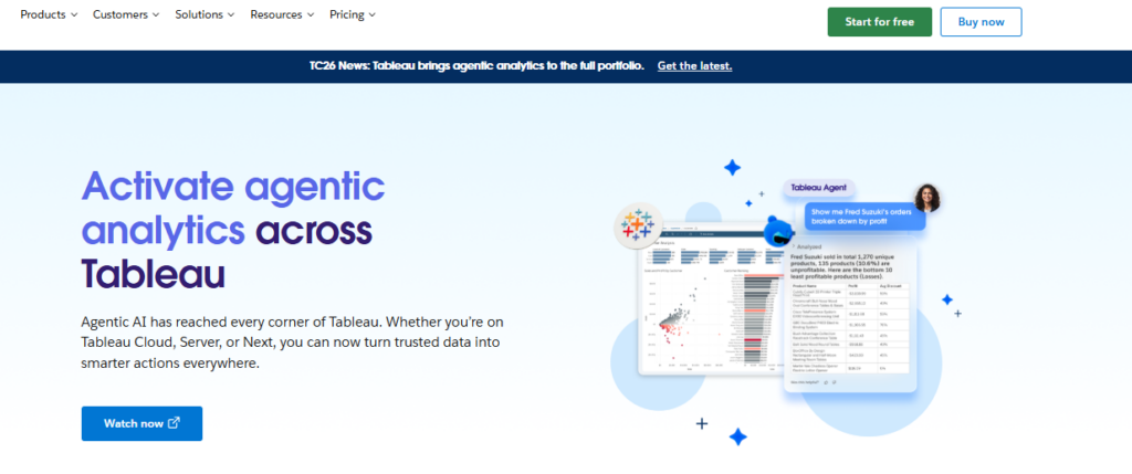
Advanced business intelligence and analytics.
Tableau remains one of the most widely recognized data visualization platforms because of its deep analytics capabilities and highly interactive dashboards.
The platform supports:
- advanced visualizations
- drill-down analytics
- real-time dashboards
- geospatial mapping
- interactive filters
- enterprise reporting
Tableau is especially strong for organizations handling large datasets and advanced business intelligence workflows.
Pros
- Extremely powerful visualizations
- Strong dashboard flexibility
- Advanced analytics
- Enterprise scalability
Cons
- Larger learning curve
- Premium pricing
Best Use Case
Businesses needing advanced enterprise analytics.
2. Microsoft Power BI
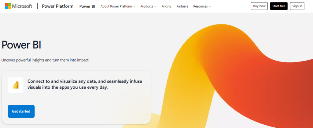
Businesses using Microsoft products.
Power BI has become one of the most popular business intelligence platforms because of its integration with the Microsoft ecosystem.
It connects seamlessly with:
- Excel
- Azure
- SQL Server
- Microsoft 365
- Dynamics
The platform provides strong reporting capabilities while remaining relatively affordable.
Pros
- Strong Microsoft integration
- Affordable pricing
- Excellent dashboards
- Enterprise-ready
Cons
- Best within Microsoft ecosystem
- Complex enterprise features
Best Use Case
Businesses already operating heavily within Microsoft infrastructure.
3. Looker Studio
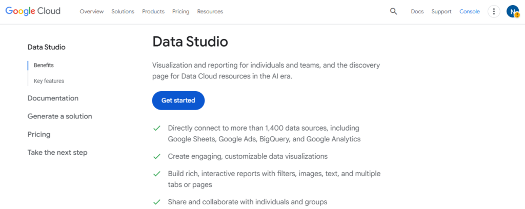
Marketing and reporting dashboards.
Looker Studio, formerly Google Data Studio, is widely used for marketing analytics and lightweight reporting.
It integrates especially well with:
- Google Analytics
- Google Ads
- Search Console
- BigQuery
- YouTube analytics
Pros
- Free platform
- Easy sharing
- Strong Google integrations
- Beginner-friendly
Cons
- Less advanced analytics
- Limited enterprise complexity
Best Use Case
Marketing reporting and lightweight dashboards.
4. Qlik Sense
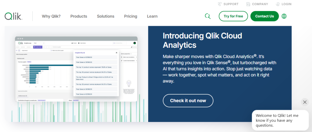
Associative analytics and data exploration.
Qlik Sense stands out because of its associative analytics engine, which allows users to explore relationships across datasets dynamically.
The platform supports highly interactive exploration workflows for enterprise analytics.
Pros
- Strong interactive analysis
- Dynamic exploration
- Enterprise functionality
- Advanced visualizations
Cons
- More technical onboarding
- Higher pricing
Best Use Case
Businesses prioritizing exploratory analytics.
5. Domo
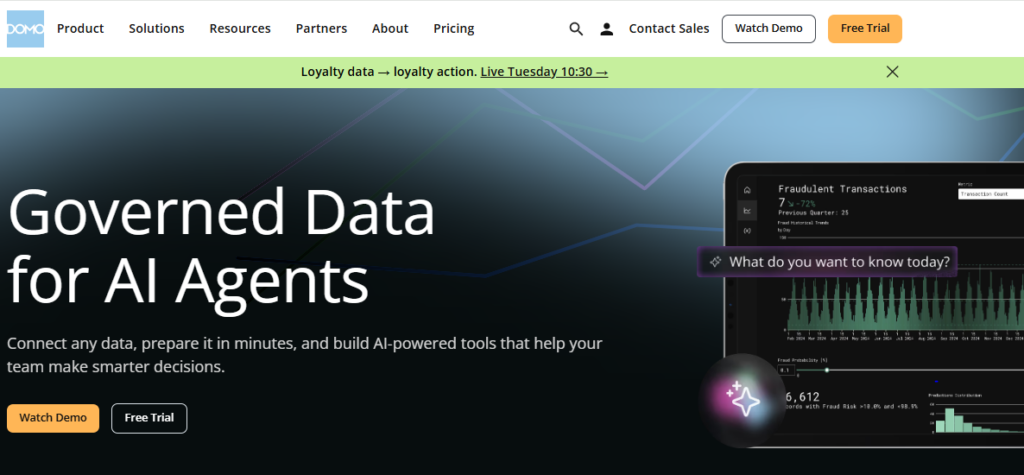
Executive business dashboards.
Domo focuses heavily on real-time operational visibility and executive reporting.
The platform combines:
- live dashboards
- cloud integrations
- KPI monitoring
- collaborative reporting
- operational analytics
Pros
- Real-time visibility
- Executive-friendly dashboards
- Strong integrations
- Cloud-native workflows
Cons
- Enterprise pricing
- Less SMB-focused
Best Use Case
Executive reporting and operational visibility.
6. Sisense
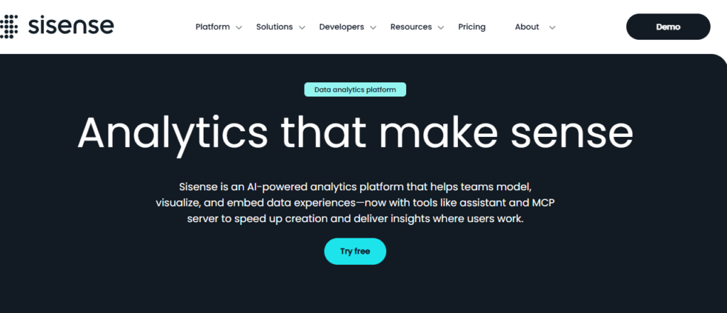
Embedded analytics platforms.
Sisense specializes heavily in embedding dashboards and analytics directly into products and customer applications.
This makes it highly valuable for SaaS businesses offering analytics to customers.
Pros
- Strong embedded analytics
- Scalable architecture
- Flexible integrations
- Enterprise functionality
Cons
- Enterprise complexity
- Premium pricing
Best Use Case
Businesses embedding analytics into products.
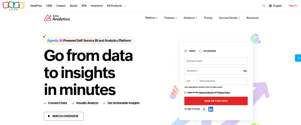
7. Zoho Analytics
Affordable SMB reporting.
Zoho Analytics offers strong business reporting capabilities at relatively affordable pricing for smaller organizations.
The platform supports:
- dashboards
- reports
- chart building
- KPI tracking
- data blending
Pros
- Affordable pricing
- Good usability
- SMB-friendly
- Strong integrations
Cons
- Less advanced enterprise analytics
- Smaller ecosystem
Best Use Case
Small and mid-sized business reporting.
8. Grafana

Real-time operational and infrastructure analytics.
Grafana is widely used for technical monitoring and operational dashboards.
The platform excels at:
- real-time metrics
- infrastructure dashboards
- cloud monitoring
- operational analytics
- time-series visualization
Pros
- Excellent real-time dashboards
- Open-source flexibility
- Strong integrations
- Highly customizable
Cons
- More technical setup
- Less business-focused visuals
Best Use Case
Infrastructure and operational analytics.
9. Apache Superset
Open-source business intelligence.
Apache Superset provides flexible open-source dashboard creation and business intelligence capabilities.
It supports:
- chart building
- SQL-based analysis
- dashboard sharing
- interactive filtering
Pros
- Free and open-source
- Flexible customization
- Strong community ecosystem
- Scalable reporting
Cons
- Technical setup required
- Less beginner-friendly
Best Use Case
Technical teams wanting open-source BI flexibility.
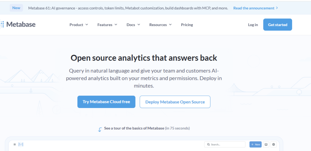
10. Metabase
Simple internal analytics.
Metabase focuses heavily on simplicity and usability for non-technical business teams.
The platform makes it easy to create dashboards and ask analytical questions without deep technical expertise.
Pros
- Very user-friendly
- Fast dashboard setup
- Good internal reporting
- Affordable scaling
Cons
- Less advanced analytics depth
- Simpler visualizations
Best Use Case
Internal team reporting and lightweight analytics.
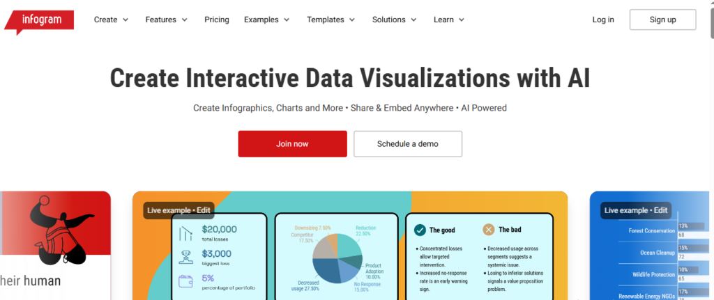
11. Infogram
Presentation-focused visual reporting.
Infogram specializes heavily in presentation-quality visual content and infographic creation.
Businesses use it for:
- reports
- presentations
- visual storytelling
- marketing visuals
- executive summaries
Pros
- Excellent presentation visuals
- Easy usability
- Strong infographic capabilities
- Fast content creation
Cons
- Less enterprise analytics depth
- Limited advanced BI functionality
Best Use Case
Presentation and storytelling-focused reporting.
12. Flourish
Interactive visual storytelling.
Flourish focuses heavily on advanced visual storytelling and interactive public-facing visualizations.
It supports:
- animated charts
- interactive maps
- storytelling dashboards
- presentation visuals
Pros
- Beautiful interactive visuals
- Strong storytelling tools
- Excellent animations
- Modern design workflows
Cons
- Less operational BI functionality
- More presentation-focused
Best Use Case
Interactive public-facing visual content.
Which Data Visualization Platform Should You Choose?
Source: Libretexts Business
The best data visualization software depends heavily on how your business uses data.
Tableau remains one of the strongest enterprise BI solutions for advanced analytics and large datasets, while Power BI offers excellent value for businesses operating inside the Microsoft ecosystem.
Marketing teams often prefer Looker Studio because of its simplicity and Google integrations, while technical teams commonly use Grafana for real-time operational dashboards.
Businesses prioritizing presentation quality may prefer Infogram or Flourish, while startups and SMBs often benefit from simpler tools like Metabase or Zoho Analytics.
The most important factor is choosing a platform that makes data easier to understand and act on rather than simply creating more dashboards.
Didn’t find what you were looking for? Try: 9 Best Business Intelligence Tools for SMBs in 2026
Frequently Asked Questions
What is the best data visualization software?
The best data visualization software depends heavily on your business goals, technical workflows, and reporting complexity. Tableau is widely considered one of the strongest platforms for advanced analytics and enterprise dashboards because of its deep interactivity and visualization flexibility.
Power BI is extremely popular among businesses using Microsoft products because of its affordability and strong ecosystem integrations. Looker Studio is commonly used for marketing dashboards and lightweight reporting, while Qlik Sense focuses heavily on dynamic exploratory analytics. Businesses prioritizing executive dashboards and operational visibility often choose platforms like Domo or Sisense.
What is data visualization software used for?
Data visualization software helps businesses transform large and often complex datasets into visual formats that are easier to understand and act on. Modern data visualization platforms are used to create dashboards, KPI trackers, charts, maps, reports, and interactive analytics environments that improve business reporting and decision-making.
Companies use these tools to monitor sales, analyze customer behavior, track marketing performance, visualize operational workflows, monitor financial metrics, and simplify business intelligence reporting across teams and departments.
What is the difference between BI software and data visualization tools?
Business intelligence software typically includes broader capabilities such as data modeling, warehousing, forecasting, advanced analytics, ETL processes, and operational reporting. Data visualization tools focus more specifically on presenting information visually through charts, dashboards, maps, and interactive reports.
However, many modern interactive dashboard tools now combine both business intelligence and visualization functionality within unified platforms. Solutions like Tableau and Power BI are considered both BI and visualization platforms because they support analytics workflows alongside visual reporting.
Can data visualization tools work with real-time data?
Yes. Most modern data visualization software platforms support real-time or near real-time data connections from APIs, cloud databases, CRMs, analytics tools, ecommerce platforms, and operational systems. This allows businesses to monitor live dashboards without manually exporting spreadsheets or updating reports constantly.
Real-time dashboards are especially useful for ecommerce operations, SaaS analytics, infrastructure monitoring, marketing performance tracking, and operational reporting where teams need continuously updated information.
What chart types are commonly used in visualization software?
Modern chart building software supports a wide range of visual formats depending on reporting goals and dataset complexity. Common chart types include:
- bar charts
- line charts
- area charts
- pie charts
- scatter plots
- treemaps
- geo maps
- Sankey diagrams
- heatmaps
- funnel visualizations
- KPI dashboards
- time-series graphs
Businesses often combine multiple visualization formats within interactive dashboards to present information more clearly and improve analysis workflows.
Is Tableau better than Power BI?
Both Tableau and Power BI are excellent data visualization platforms, but they serve slightly different audiences and business environments. Tableau is often preferred for advanced analytics, deep interactivity, highly customized dashboards, and complex enterprise reporting.
Power BI is widely adopted because of its affordability, accessibility, and strong integration with Microsoft products such as Excel, Azure, SQL Server, and Microsoft 365. Businesses already operating heavily inside the Microsoft ecosystem often find Power BI easier to integrate operationally.
What is an interactive dashboard?
An interactive dashboard is a visual reporting environment that allows users to explore data dynamically rather than viewing static charts or reports. Modern interactive dashboard tools allow users to apply filters, drill down into datasets, switch between visualizations, analyze trends, and customize reporting views in real time.
Interactive dashboards are commonly used for business intelligence, operational monitoring, marketing analytics, financial reporting, and executive decision-making because they make large datasets easier to explore and understand.
What is drill-down functionality in data visualization?
Drill-down functionality allows users to click into charts, reports, or visualizations to access more detailed layers of information. For example, a business might start with company-wide revenue data and then drill down into individual regions, products, campaigns, or customer segments.
Drill-down analytics are extremely important in modern data presentation software because they allow teams to move from high-level summaries into detailed operational insights quickly without creating separate reports manually.
Can data visualization software be embedded into websites or apps?
Yes. Many modern data visualization platforms allow businesses to embed dashboards, charts, and reports directly into websites, SaaS products, customer portals, and internal business systems.
Embedded analytics are especially valuable for SaaS companies offering reporting functionality to customers or businesses wanting centralized reporting inside operational platforms. Solutions like Sisense, Tableau, and Power BI offer strong embedded analytics capabilities for product integrations and client-facing dashboards.
Are free data visualization tools good enough for businesses?
Free visualization tools can work very well for smaller businesses, startups, and lightweight reporting workflows depending on complexity requirements. Platforms like Looker Studio, Grafana, Apache Superset, and Metabase provide strong reporting capabilities at little or no cost.
However, larger organizations handling advanced analytics, enterprise governance, large-scale data infrastructure, or highly customized dashboards often require more advanced paid platforms with enterprise security, scalability, support, and collaboration features.
What industries use data visualization software?
Almost every industry now uses data visualization software in some capacity because businesses increasingly rely on analytics and reporting to improve decision-making. Common industries using visualization platforms include:
- ecommerce
- SaaS
- healthcare
- finance
- logistics
- manufacturing
- marketing
- education
- cybersecurity
- retail
- operations
- cloud infrastructure
Visualization tools help teams identify trends, communicate insights, monitor KPIs, and simplify complex operational data across departments.
Can data visualization improve business decision-making?
Yes. One of the biggest advantages of using modern data visualization platforms is improved decision-making speed and clarity. Visual reporting makes trends, anomalies, bottlenecks, and performance patterns easier to identify compared to spreadsheets or static reports.
Executives, marketers, analysts, operations teams, and financial departments can all make faster and more informed decisions when information is presented visually through dashboards, interactive charts, and real-time reporting systems.
Software Chronicle’s Guide to Smarter Analytics & SaaS Tools
At Software Chronicle, we publish practical SaaS reviews, analytics software comparisons, automation guides, and business technology insights designed to help companies choose smarter digital tools.
To learn more about how we evaluate platforms, visit our How We Review Software page. You can also review our Affiliate Disclosure for transparency regarding affiliate partnerships and recommendations.
Have questions? Contact us now.

Najm Us Sahar Fareed is part of the editorial team at Software Chronicle, a group of SaaS researchers and former software buyers who have collectively evaluated over 200 tools across the categories we cover. With 5 years of experience working with digital marketing agencies across North America, she brings a strong background in content strategy and practical software evaluation.
Blog
CRM for Freelancers: Do You Really Need One?
The honest answer is that most freelancers don’t need one, right up until the exact moment they very obviously do, and the gap between those two states is smaller than the CRM industry’s marketing wants you to believe. A freelancer with six active clients, decent invoice tracking habits, and a good memory can run their whole business from a spreadsheet and a calendar reminder. A freelancer with twenty-five clients across three service types, half of them on retainers, cannot, and pretending otherwise is how a proposal gets forgotten and a client gets lost.
Whether you’re searching for a CRM for consultants, a CRM for independent contractors, or just a CRM for freelance designers billing by the project, this isn’t a roundup pretending every solo CRM user needs the same tool a sales team does, or a list of affiliate links dressed up as advice.
It’s a genuine answer to whether you need one at all, and if the answer turns out to be yes, which kind actually fits a small CRM for one person rather than the sales-team tool your business logic was borrowed from, whether you call yourself a freelancer, a consultant, or an independent contractor.
Our deeper comparison of running client management on a CRM versus a spreadsheet covers the mechanics of that decision in more depth than this piece has room for.
TL;DR
- The real trigger isn’t a headcount rule of thumb; it’s whether you’re currently losing track of a proposal, a follow-up, or an invoice. If nothing is slipping, a spreadsheet is still doing its job.
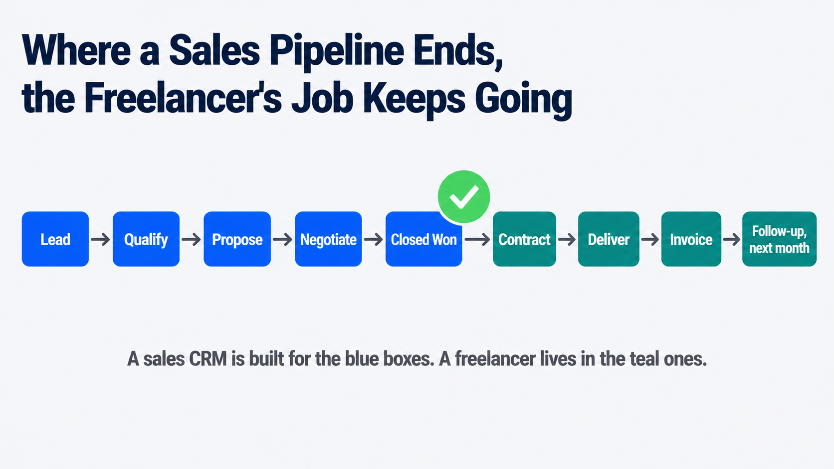
- A freelance CRM and a traditional sales CRM solve different problems. Sales CRMs manage a pipeline that ends at “closed won.” Freelancer tools manage everything that happens after that: proposals, contracts, retainer invoicing, and a client portal.
- Free genuinely exists here: HubSpot’s free CRM tier and Notion, which isn’t built as a CRM but is widely used as one, both cost nothing and cover the basics competently.
- Watch for the “free trial that’s really a demo” trap. Some freelancer-focused tools cap a free plan at three or five clients, which reads as generous and functions as a paywall for anyone with real client volume.
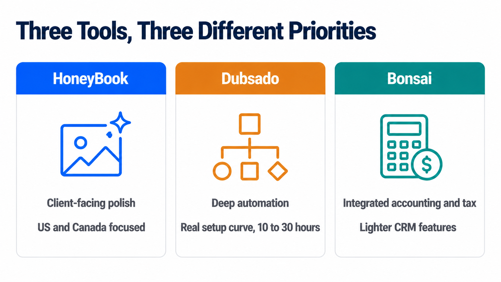
- HoneyBook, Dubsado, and Bonsai are the three names that dominate this category, and they solve genuinely different priorities: polish, deep automation, and integrated accounting, respectively, not the same tool at three price points.
- Client portal access is the single feature that most changes a freelancer’s day-to-day admin load, since it moves “can you resend that invoice” out of your inbox entirely.
- The decision to add a CRM is really a decision about what a forgotten follow-up currently costs you. Price that honestly before pricing any of the tools.
The Real Trigger Isn’t a Client Count
Most advice in this category gives you a number, “once you have ten clients” or “past fifteen active projects,” and numbers like that are comforting because they’re easy to check and mostly beside the point. The actual signal is behavioral, not numerical: are you currently forgetting things? A proposal you meant to follow up on that went quiet for three weeks. An invoice you’re pretty sure you sent but can’t confirm without digging through email. A client whose project status lives only in your memory, and it’s a Friday afternoon, and you can’t quite remember if you’re waiting on them or they’re waiting on you.
If none of that is happening, a well-organized spreadsheet with a consistent set of columns- client name, status, last contact date, next action- is a completely legitimate system, and switching to a paid tool at that point adds a subscription without solving a problem you don’t have. If any of that is happening regularly, the spreadsheet has already failed, quietly, and a proposal follow-up system tuned specifically for freelance work is worth its monthly cost many times over the first time it catches something you’d have dropped.
Why a Sales CRM Is Usually the Wrong Shape
This is where a lot of freelancers waste real setup time. A traditional CRM, HubSpot’s sales product, Pipedrive, Salesforce, is built around a pipeline with a clean ending: a deal moves through stages and closes, won or lost, and the tool’s whole design assumes a team working that pipeline together.
Our comparison of CRMs built for B2B sales teams makes this shape explicit, and it’s worth reading precisely to see how differently that category is built. Freelance work doesn’t end at closed won; it starts there. You’re the one drafting the proposal, negotiating the scope, delivering the project status update, tracking hours if you bill hourly, sending the invoice, following up on the invoice, and starting the retainer conversation for next month, alone, often for a dozen clients simultaneously.
A tool built for a sales team’s handoff between departments solves a problem you don’t have and skips the one you do, which is exactly why a separate category of single-user CRM built specifically for freelancers and consultants exists at all.
The Free Options Worth Trying Before You Pay Anything
For anyone specifically hunting for a free CRM freelancer option rather than a paid subscription, two genuinely free routes exist, and both are legitimate starting points rather than crippled trials.
HubSpot’s free CRM tier covers contact and deal tracking competently and costs nothing indefinitely, not just for a trial window. It’s a real sales-style CRM, though, so it inherits the pipeline shape described above, useful for tracking who you’re talking to and where a conversation stands, less useful for the proposal-to-invoice workflow that’s the actual daily grind of freelance client management.
Notion isn’t built as a CRM at all, and a large number of freelancers use it as one anyway, building a client database with linked pages for proposals, notes, and status, entirely custom to how they actually work. The honest trade-off: total flexibility in exchange for building the system yourself, with no automated reminders or client portal unless you construct them, which for someone who already thinks in Notion is a genuine advantage and for someone who doesn’t is real setup work for no clear payoff.
Read next: if you’re weighing whether to stay on a spreadsheet at all, our full breakdown of CRM versus spreadsheets walks through exactly where a spreadsheet stops scaling and why.
When You’ve Actually Outgrown the Spreadsheet
Three names dominate the freelancer-specific category, and they’re worth understanding as three different priorities rather than three tiers of the same product.
HoneyBook is the most client-facing and polished of the three, with strong proposal design, integrated payments, and a client portal built to look professional to someone hiring you for the first time. It’s priced at the higher end of this category, and it’s primarily built for the US and Canadian market, which is a real constraint if you bill clients internationally.
Dubsado leads on automation depth, branching email sequences, and conditional workflows that can run an entire client onboarding process without you touching it after the first trigger. That depth comes with a genuinely steep setup curve, commonly cited at ten to thirty hours to configure properly, and its free plan caps at three clients, which one honest reviewer flatly called a demo rather than a real free tier, a fair description for anyone with real client volume.
Bonsai sits at a lower entry price than either and differentiates on integrated accounting and tax estimation built specifically for US sole proprietors, alongside contracts and time tracking. Its CRM and communication-tracking features are comparatively lighter than HoneyBook’s or Dubsado’s, which is the right trade for a freelancer whose real pain point is disorganized invoicing and tax prep rather than a complex sales process.
Pricing across all three genuinely moves and varies by promotion, so treat any specific figure as a starting point to confirm on the vendor’s own pricing page rather than a locked-in number. If you do decide to switch, our guide on how to choose a CRM covers the evaluation questions worth asking regardless of which of the three you’re leaning toward.
Frequently Asked Questions
Do you really need a CRM in 2026?
Only if something is currently slipping through the cracks of whatever system you’re using now. The year doesn’t change the answer; the behavior does. A freelancer with a handful of long-term clients and a reliable habit of checking a spreadsheet weekly has no real gap a CRM closes. A freelancer juggling a growing, varied client list who’s already missed a follow-up or sent a late invoice has a gap that’s costing real money, and closing it is worth a subscription.
What is the best CRM for freelancers?
There isn’t one best answer, because HoneyBook, Dubsado, and Bonsai solve different priorities rather than competing head-to-head on the same thing. HoneyBook for client-facing polish, Dubsado for deep automation once you’re willing to invest real setup time, Bonsai for integrated accounting alongside lighter CRM features. The better question to ask yourself first is which specific pain point is costing you time right now: disorganized proposals, manual invoice chasing, or messy client communication, since that answer points to a different one of the three.
Which CRM is beginner friendly?
Bonsai and HubSpot’s free tier are the two most forgiving starting points, for different reasons. Bonsai’s interface is deliberately simple, and most of its features work reasonably well out of the box without heavy customization, which suits someone who wants a working system on day one rather than a project to configure. HubSpot’s free CRM has a gentler learning curve specifically because its scope is narrower- contacts and deals- without the proposal, contract, and portal features the freelancer-specific tools add. Dubsado, by contrast, is the one most consistently described as having a real learning curve, powerful once configured and genuinely time-consuming to get there.
Is Upwork or Fiverr better?
That’s a separate decision from whether you need a CRM, and it depends mainly on how you prefer to find work. Upwork tends to suit ongoing, higher-value client relationships and hourly or longer-term contracts, while Fiverr is built around fixed-price, productized gigs a buyer can purchase directly. Worth noting for this article’s actual topic: neither platform replaces a CRM, since both are lead sources, not client management systems, and freelancers who rely on either one still need somewhere to track proposals and follow-ups once a project moves off the platform.
A brief editorial note: one supplied question for this article, about specific top freelancers in a particular country, isn’t something this piece can answer responsibly. Naming individual freelancers as “the best” would require claims we have no way to verify, and it sits outside what this article is actually about- CRM software rather than freelancer rankings- so we’ve left it out rather than guess.
How Software Chronicle Researches and Publishes Software Reviews
Software Chronicle is an independent publication covering business and developer software. We look at what a tool is actually built to solve rather than treating every CRM as interchangeable, and we say plainly when the honest answer to “do you need this” is no. No software vendor owns us, funds us, or influences our editorial decisions. More about who we are is on our About us page.
Some links in this article are affiliate links, which means we may earn a commission if you purchase through them at no additional cost to you. Those arrangements never affect which tools we include or how we rank them. The specifics are in our affiliate disclosure, and the process behind every comparison is documented in our how we review software page. Pricing in this category moves often and varies by promotion, so confirm current rates directly with the vendor before subscribing. If you spot something out of date or want a tool considered for a future update, contact us.
Najm Us Sahar Fareed is part of the editorial team at Software Chronicle, a group of SaaS researchers and former software buyers who have collectively evaluated over 200 tools across the categories we cover. With 5 years of experience working with digital marketing agencies across North America, she brings a strong background in content strategy and practical software evaluation.
Blog
CRM for Real Estate Agents: Best Options

If a “best real estate CRM” list you are reading in 2026 still recommends LionDesk, stop reading it. Lone Wolf Technologies, which bought LionDesk in 2021, wound the product down at the end of September 2025 and migrated existing accounts to a new platform called Lone Wolf Relationships.
New signups have not been possible for months. A surprising number of comparison articles still list it as a budget pick, which tells you those articles have not been checked since before the shutdown, and it is a useful filter for how much to trust the rest of their numbers.
That kind of churn is normal in this category specifically. Real estate CRMs are not a slower-moving version of general CRM software; they are a genuinely different market shaped by brokerage politics, MLS data feeds, and lead-buying economics that a HubSpot or Pipedrive comparison never has to account for.
This guide covers what actually separates a real estate CRM from a general one, current pricing, and the ownership question that decides more outcomes than any feature list for anyone comparing property management CRM options against pure sales tools. For the general buying framework underneath all of this, our guide on how to choose a CRM is worth reading alongside this one.
Quick Takeaways
- LionDesk was discontinued at the end of September 2025. If a 2026 list still recommends it, treat every other figure in that list as unverified too.
- Follow Up Boss is CRM-only, no IDX website, no lead generation, so it is not directly cost-comparable to bundled platforms like kvCORE.
- Data portability is the decision most lists skip. Brokerage-provided CRMs such as kvCORE inside eXp or KW Command typically do not export cleanly when you change brokerages. Independent CRMs travel with you.
- Wise Agent covers up to five people for around $49 a month, which makes it the strongest value pick for a small team rather than just a solo agent.
- Contract terms vary sharply. Sierra Interactive and CINC lock you into a non-refundable twelve-month term. Follow Up Boss, Wise Agent and most CRM-only tools run month to month.
- MLS integration is not universal. Confirm a tool syncs with your specific local MLS before paying for anything, since coverage is regional and inconsistent between vendors.
- Real Broker’s proprietary reZEN platform handles transactions and compliance, not lead nurture. Agents get a bundled Lofty CRM account for that side of the business.
- Automated drip campaigns and lead routing are the two features that separate a real estate CRM from a general one. If a tool cannot do both well, it is not really built for this industry regardless of what it claims.
What Makes a CRM “Real Estate” Rather Than General
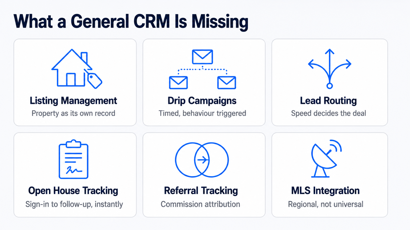
For anyone searching crm for realtors rather than a generic sales tool, the distinction starts here: a general-purpose CRM tracks a deal through a pipeline. A real estate CRM has to do that plus several things unique to how property transactions actually work.
| Capability | What it does | Why general CRMs handle it poorly |
| Listing management | Tracks a property’s status, showings, and documents alongside the client record | General CRMs have no concept of a property as its own linked object |
| Automated drip campaigns | Long-running, behaviour-triggered email and text sequences tailored to buyer or seller stage | Generic automation exists, but real estate templates and timing are pre-built here |
| Lead routing | Assigns a new lead to the right agent by territory, price band or round robin, instantly | Speed matters enormously in this industry; a slow routing rule loses the lead |
| Open house tracking | Digital sign-in, instant follow-up sequencing, and attendee data feeding straight into the pipeline | Not a concept that exists outside real estate |
| Referral tracking | Attributes a closed deal back to the referring agent or client for commission and relationship purposes | General CRMs track deal source, not referral commission chains |
| Client follow-up cadence | Reminds an agent when a past client’s mortgage anniversary or moving window is likely, not just active leads | General CRMs have no concept of a dormant client worth re-engaging on a schedule |
| MLS integration | Pulls live listing data and IDX website content directly into contact and property records | Requires a licensed data feed specific to each regional MLS |
The first two rows, listing management and drip campaigns, are where the category earns its existence. Everything else is a real differentiator, but a tool that gets those two wrong is not worth considering regardless of what else it offers.
The Tools Worth Comparing
| Tool | Best for | Starting price | Contract |
| Follow Up Boss | Teams buying leads from multiple sources, speed-to-lead | $69/user/mo (Grow), $58 annual | None |
| Wise Agent | Solo agents and small teams on a budget | ~$49/mo, covers 5 users | None |
| kvCORE | Brokerages wanting an all-in-one platform with IDX and lead gen | ~$499/mo and up, enterprise pricing | Varies, often annual |
| Lofty | Agents wanting AI-assisted lead nurture bundled with a website | Custom, varies by plan | Varies |
| Real Geeks | Small teams wanting CRM plus IDX at a lower price than kvCORE | From several hundred/mo | Six- or twelve-month options |
| Sierra Interactive | Established teams wanting a premium lead-gen bundle | ~$399+/mo | Twelve months, non-refundable |
| CINC | Top producers running heavy paid lead spend | $899+/mo | Fixed term, early exit costs remaining balance |
| Lone Wolf Relationships | Former LionDesk users staying in the Lone Wolf ecosystem | Not publicly listed | Not publicly listed |
| HubSpot Free | Very early-stage agents wanting a genuinely free start | $0 | None |
Prices in this category are unusually inconsistent between sources, and several vendors do not publish pricing at all, so treat every figure here as a starting point to confirm directly with the vendor rather than a quote you can act on. Follow Up Boss is worth a specific flag: it is CRM and lead management only, with no IDX website and no bundled lead generation, so comparing its $69 to kvCORE’s $499 without adding a website and lead source elsewhere is comparing two different products, not two prices for the same thing.
Read Also: How to Implement CRM Software
The Question Every Comparison List Skips: Who Owns Your Data
This is the single most consequential decision in this category, and it rarely appears in a feature comparison.
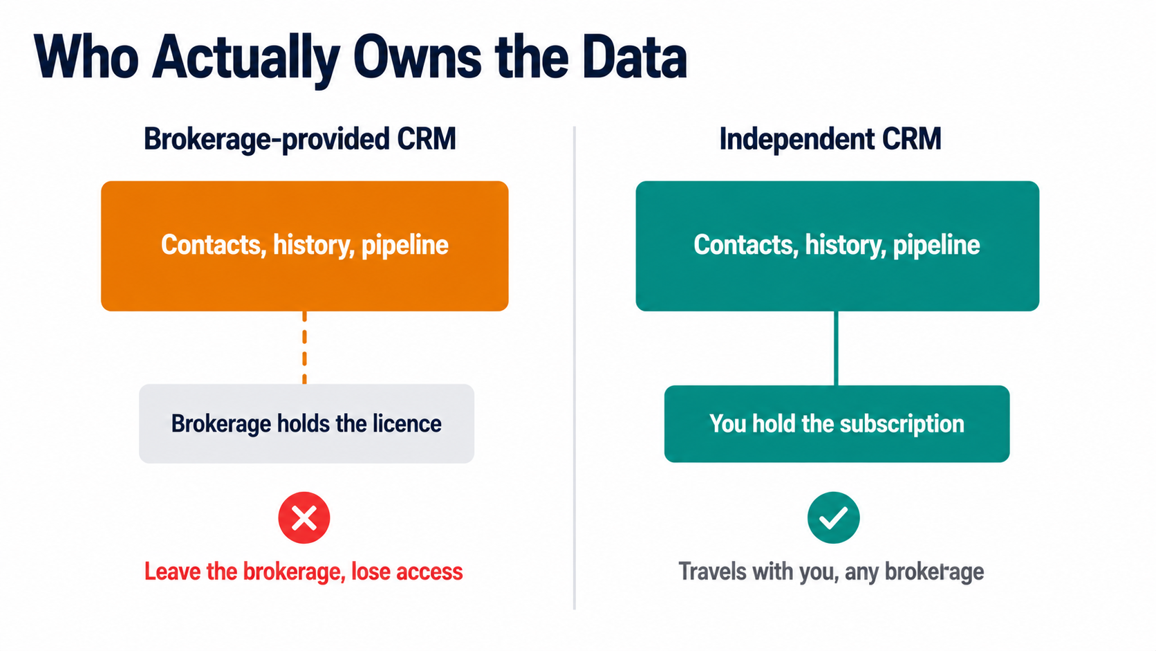
Brokerage-provided CRMs, kvCORE bundled inside an eXp Realty cloud fee, KW Command inside Keller Williams, are typically tied to your brokerage affiliation. Leave the brokerage, and you generally lose access to the contact records, communication history, and pipeline you built inside that system, because the license belonged to the brokerage, not to you.
For an agent who expects to stay at one brokerage for a career, that is a non-issue. For an agent who might move brokerages, and a meaningful share does, it is a real cost that never shows up on a pricing page.
Independent, portable CRMs- Follow Up Boss, Wise Agent, and Top Producer- among them- travel with you regardless of brokerage affiliation, because you hold the subscription and the data personally. Paying for a portable CRM out of your own pocket rather than accepting a free brokerage-bundled one is, in effect, an investment in career flexibility. Weigh that against the real convenience of a bundled system before assuming free is actually cheaper.
The same logic applies to Real Broker specifically, which is worth naming since it comes up often. Real’s proprietary reZEN platform is the transaction and compliance back office, tracking contracts, commission caps, and broker review, and every Real agent uses it for that. It is not, itself, a lead-nurture CRM. Real bundles a Lofty Core account for agents to handle that side, at no separate monthly fee, which is a genuinely good deal, though agents who want a different CRM are free to bring their own rather than being locked into Lofty specifically.
Contract Terms Are the Other Trap
The second thing pricing pages bury: whether you can actually leave.
Sierra Interactive and CINC both require a fixed term, typically twelve months, and their published terms state fees are non-refundable, with CINC specifically requiring you to pay out the remaining balance to exit early. Real Geeks offers six- or twelve-month commitment options rather than a single fixed term. Follow Up Boss, Wise Agent and most CRM-only tools run month to month with no contract at all.
This matters more in real estate than in most CRM categories because these platforms are frequently sold bundled with paid lead generation, and the sales conversation understandably focuses on projected lead volume rather than the exit terms.
Ask directly, before signing, what happens if the tool underperforms in month four. A month-to-month tool costs you one bad month. A twelve-month non-refundable contract costs you a year.
Best CRM Realtor Picks by Where You Are in Your Business
| Stage | Sensible pick | Why |
| New agent, first year | HubSpot Free or Wise Agent | Learn the habit of logging every contact before paying for volume you do not yet have |
| Solo agent, steady deal flow | Wise Agent or Follow Up Boss Grow | Automated drip campaigns without team-management overhead |
| Small team, 2 to 10 agents, buying leads | Follow Up Boss Pro | Lead routing and speed-to-lead reporting across multiple sources |
| Team wanting website plus CRM in one bill | Real Geeks or Lofty | Avoids stitching together a separate IDX site and CRM |
| Brokerage or large team, heavy paid lead spend | kvCORE, BoomTown or CINC | Bundled lead generation at volume, accept the contract terms as the cost of that |
| Agent who just left a brokerage-bundled CRM | Any portable, independent tool | Rebuild ownership of your own contact data going forward |
Automated drip campaigns and lead routing deserve one final word, because they are the two features worth testing directly rather than trusting a spec sheet on. Before committing, send yourself a test lead through whatever public form the tool would capture it from, and time how long it takes to land in front of an agent with a first client follow-up message already queued. That single test tells you more about a real estate CRM’s actual value than any comparison table, including this one.
Frequently Asked Questions
Which CRM is best for real estate, and what should real estate contact management actually include?
There is no single best, because “best” depends entirely on whether you are buying a CRM alone or a CRM bundled with lead generation. For CRM-only, Follow Up Boss is the strongest all-around pick for teams, and Wise Agent is the strongest value pick for solo agents and small teams. For a bundled platform with an IDX website and lead source included, kvCORE, Real Geeks, and Lofty are the names worth comparing, at meaningfully different price points. The genuinely useful filter before comparing further: decide whether you are also buying a website and lead source in this purchase, or handling those separately, because that single decision eliminates half the list either way.
What is the most popular CRM for real estate agents?
Follow Up Boss and kvCORE are the two names that come up most often, for different reasons. Follow Up Boss has broad organic adoption among independent teams specifically because it plugs into over 250 lead sources rather than trying to be one itself, so agents already buying leads from Zillow, Realtor.com, and elsewhere consolidate them there. kvCORE’s popularity comes largely through brokerage-level adoption. Since eXp Realty bundles it into every agent’s cloud brokerage fee, a very large number of agents use kvCORE simply because their brokerage chose it for them, not because they individually selected it, which is worth knowing before treating adoption numbers as a quality signal.
What is the best free CRM software for real estate agents?
HubSpot’s free tier, with the honest caveat that it was not built for real estate specifically. It has no MLS integration, no listing management, and no real estate drip templates, so you are trading category-specific features for zero cost and a genuinely capable general CRM underneath. For a brand new agent with very few contacts and no budget yet, that trade is reasonable, since the habit of consistent follow-up matters more at that stage than automation sophistication. Once deal volume justifies it, migrating to Wise Agent or Follow Up Boss recovers the real-estate-specific features HubSpot’s free tier does not have.
Which CRM does Real Broker use?
Real Broker’s own proprietary platform, reZEN, handles transactions and back-office compliance, and it bundles a free Lofty CRM account for lead nurture, which is a different job. This distinction gets flattened in a lot of coverage that describes reZEN as Real’s CRM, which is not quite accurate. reZEN tracks contract-to-close, commission caps, and broker review. Lofty, bundled at no additional monthly fee, is the tool that actually handles automated drip campaigns and lead follow-up. Agents who prefer a different CRM are not locked into Lofty and can bring Follow Up Boss or Wise Agent instead, though doing so means paying for a second tool on top of what is already included.
How Software Chronicle Researches and Publishes Software Reviews
Software Chronicle is an independent publication covering business and developer software. We check whether a product is still sold before recommending it, which matters unusually often in this specific category, and we flag where a vendor does not publish pricing rather than repeating an outdated figure as current. No software vendor owns us, funds us, or influences our editorial decisions. More about who we are is on our About us page.
Some links in this article are affiliate links, which means we may earn a commission if you purchase through them at no additional cost to you. Those arrangements never affect which tools we include or how we rank them. The specifics are in our affiliate disclosure, and the process behind every comparison is documented in our how we review software page. Real estate CRM pricing, contract terms, and brokerage bundling change frequently, so confirm current terms directly with the vendor and your brokerage before committing. If you spot something out of date or want a platform considered for a future update, contact us.
Najm Us Sahar Fareed is part of the editorial team at Software Chronicle, a group of SaaS researchers and former software buyers who have collectively evaluated over 200 tools across the categories we cover. With 5 years of experience working with digital marketing agencies across North America, she brings a strong background in content strategy and practical software evaluation.
Blog
CRM Integration Guide: Connect Your Tools Without Breaking Your Data
A CRM only earns its licence fee when it becomes the place your team checks first. That happens when the tools around it feed into it automatically, and it stops happening the moment someone has to copy a deal value from an invoice into a custom field by hand. The gap between those two states is integration work, and most of it goes wrong for reasons that have nothing to do with technical difficulty.
The failures are almost always design decisions made too fast. Nobody decided which system owns the email address field, so two of them overwrite each other nightly. Nobody set a matching rule, so the same customer exists three times under slightly different spellings. Nobody checked what happens when a sync fails at 3 am, so a week of leads sits in a queue nobody is watching.
This guide covers the decisions in the order you need to make them. If you are still working out what the underlying system does, start with our explainer on how CRM software works.
Quick Takeaways
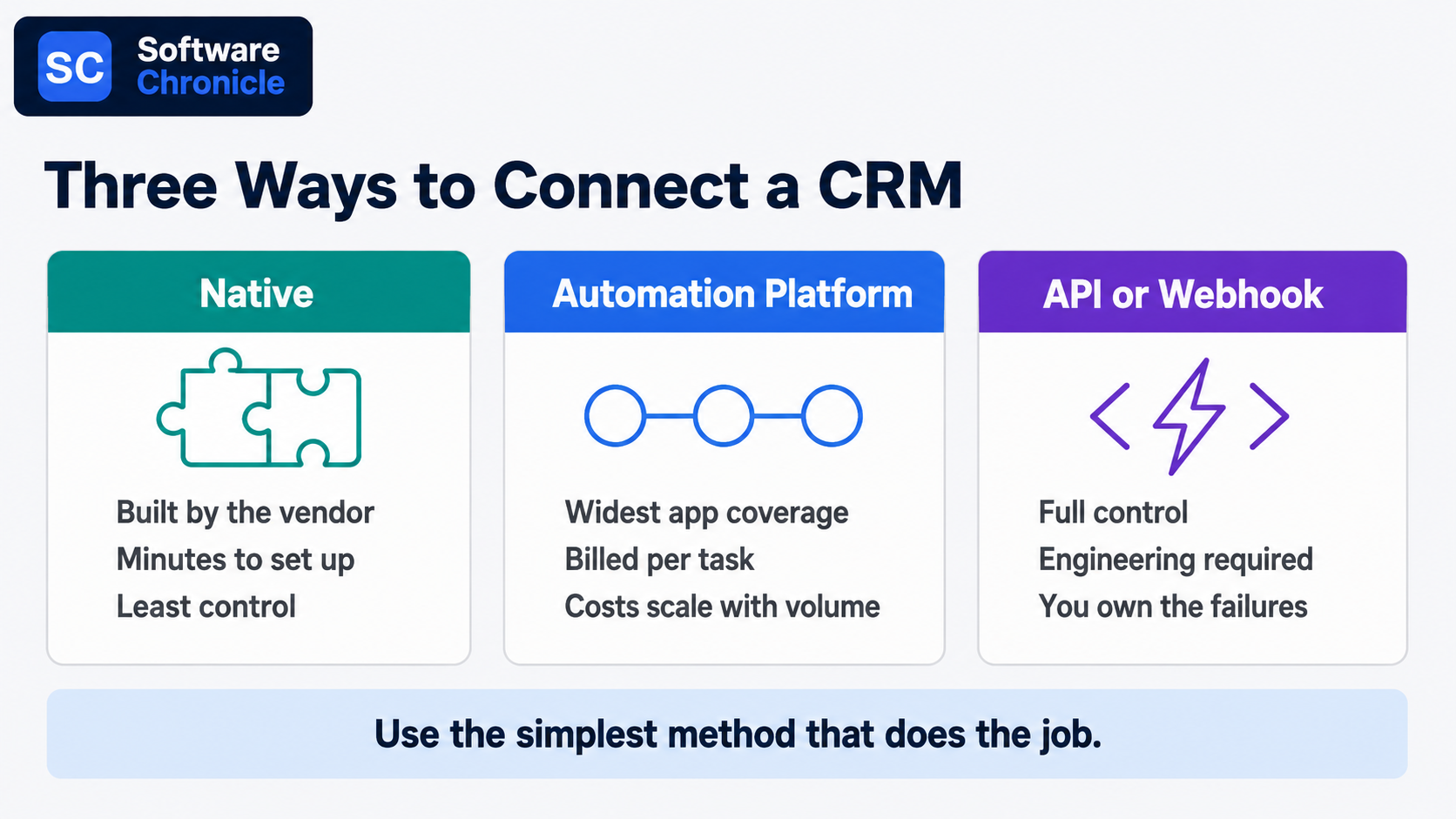
- Three connection methods cover almost everything: native integrations, an automation platform like Zapier or Make, and direct API or webhook work. Use the simplest one that does the job.
- Decide field ownership before you connect anything. One system owns each field, and every other system reads it.
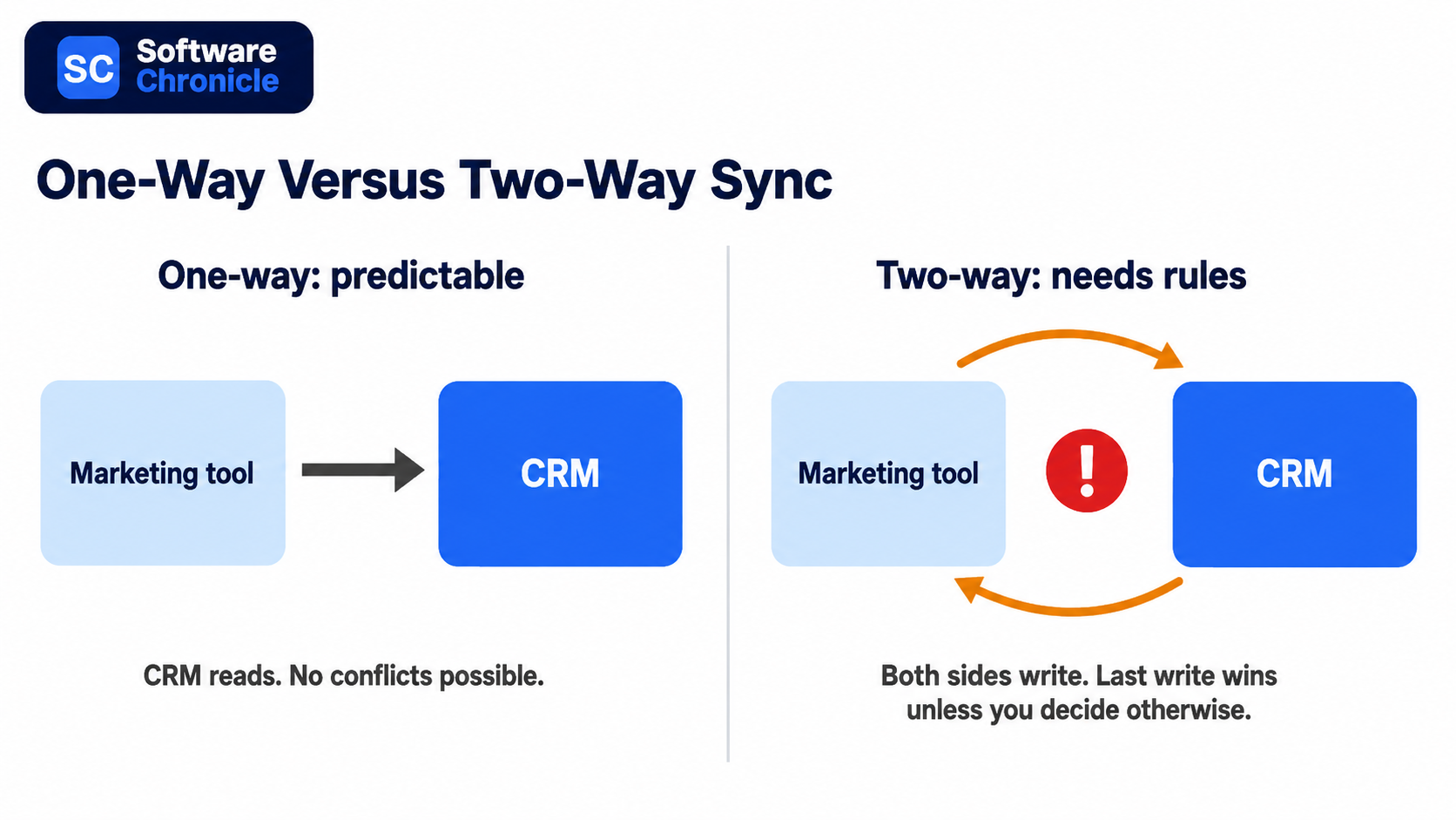
- Bi-directional sync doubles the failure surface. Default to one-way unless both teams genuinely edit the same data.
- Set a matching rule first, usually email address or a unique customer ID. Duplicate records are the single most common integration outcome.
- Marketplace size is a poor buying signal. Salesforce lists thousands more apps than HubSpot, but most teams run ten to fifteen integrations total.
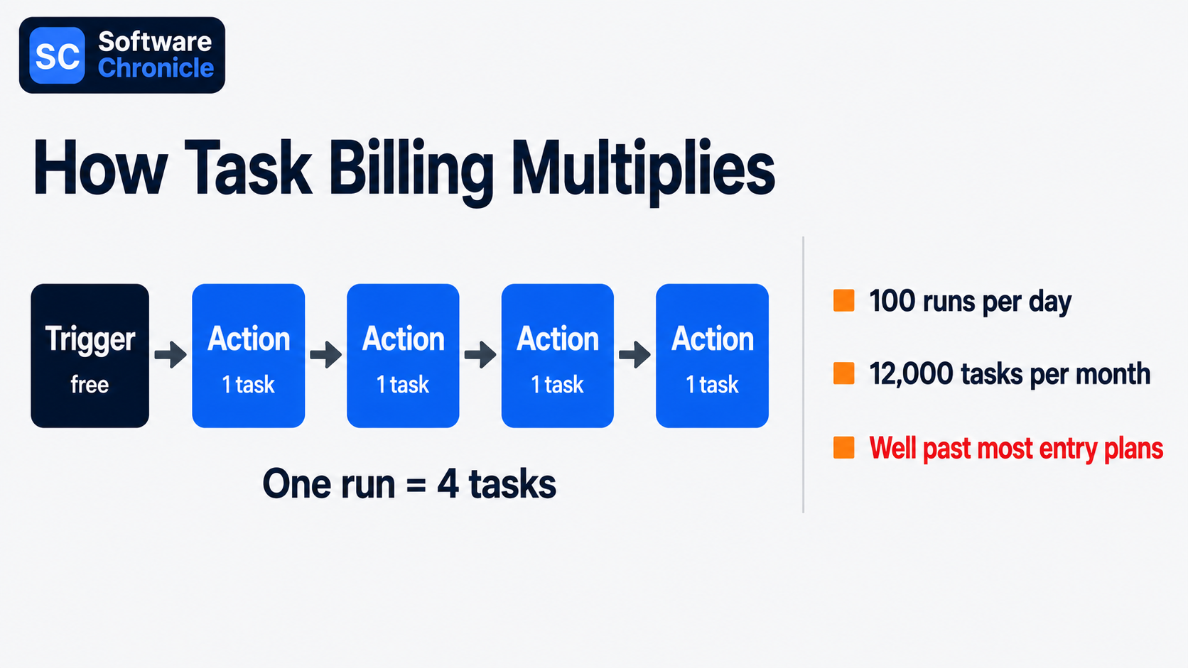
- Task-metered automation platforms bill per action step, not per workflow, so a five-step automation costs five times what the pricing page implies.
- Build monitoring in from day one. Silent sync failures are worse than loud ones because nobody finds them for weeks.
- Phone numbers are becoming an unreliable identifier for messaging integrations. Store a platform-specific ID alongside them.
Three Ways to Connect Anything to a CRM
Every integration decision starts here, and picking the wrong method costs either money or engineering time.
| Method | Best for | Setup effort | Ongoing cost | Main risk |
| Native integration | Common tools your CRM already supports | Minutes | Usually included | Limited field mapping control |
| Automation platform | Connecting tools with no native option | Hours | Metered per task or operation | Costs scale with volume, not value |
| Direct API or webhook | Custom logic, high volume, proprietary systems | Days to weeks | Engineering maintenance | You own every failure mode |
Native integrations should always be your first check. They are built and maintained by the vendors; they usually handle authentication and retries for you, and they cost nothing extra. HubSpot’s marketplace lists over 2,000 apps, and Salesforce’s AppExchange, now rebranded AgentExchange, lists several thousand more.
Neither number should drive your CRM choice, because the marketplace gap matters far less than whether the eight tools you actually use are covered.
Automation platforms fill the gaps. Zapier connects the widest range of apps and is the easiest to learn. Make costs substantially less per unit of work because it bills per operation across a whole scenario rather than per step, and n8n removes platform cost entirely if you are willing to self-host. The right choice depends less on features than on volume, which we will come back to.
Direct API work earns its keep in two situations: when you are moving high volumes where per-task billing becomes absurd, and when the logic is specific enough that no off-the-shelf connector expresses it. Webhooks are the underrated half of this. Instead of polling a system every fifteen minutes asking whether anything changed, you let it push an event to you the moment something does. Faster, cheaper, and less load on both sides.
Decide Sync Direction Before You Connect Anything
This is the section most integration guides skip, and it is where the expensive mistakes live.
One system owns each field
Write down every field that will exist in more than one system, and next to each one, name the single system that owns it. Marketing owns email subscription status. Finance owns invoice amounts. Sales owns deal stage.
The owning system writes; everything else reads. Without this, two integrations end up writing to the same field on different schedules and the value flips back and forth indefinitely, which is a bug that takes weeks to notice and hours to explain.
Bi-directional sync is a commitment, not a feature
Vendors sell two-way sync as the premium option, and sometimes it genuinely is what you need, for example, a CRM and a support desk where both teams legitimately update the same contact details.
But two-way sync means you now need conflict resolution rules for what happens when both sides change the same record between syncs. Most tools resolve this with last-write-wins, which quietly means the system that syncs most often always wins regardless of which team was right. Start one-way. Add the reverse direction only when someone can articulate the specific case that requires it.
Set the matching rule explicitly
Every integration needs to answer “is this the same person?” and the default answers are often wrong. Email address is the usual choice and works well until someone changes jobs. A stable internal customer ID is better where you have one.
Whatever you pick, decide up front what happens when no match is found: create a new record, or hold it for review. Auto-creating is how a clean database becomes 40,000 records with 12,000 duplicates.
The Integrations Most Teams Actually Need
Six connections cover the majority of real value. Build them in roughly this order.
Email. The Gmail or Outlook integration is the one that determines whether reps use the CRM at all, because it removes the manual logging step. Two-way calendar and email sync, with a clear rule about which messages get logged, is table stakes rather than an advanced feature. Check whether your CRM logs email to the contact record automatically or requires a plugin per rep.
Calendar. Meeting booking links that write straight to the CRM as an activity, plus availability that respects the rep’s real calendar. Low effort, immediately visible payoff.
Marketing automation. This is the integration with the most field-ownership traps, because subscription status, lifecycle stage, and lead score all get written by both sides in an unmanaged setup. Whether you need a full automation platform or just email sending is worth settling first, and our comparison of marketing automation versus email marketing covers that distinction.
Slack or Teams. Notifications only, one-way, into channels rather than DMs. The failure mode is volume: alert on deals over a threshold or stage changes on named accounts, not on every record update, or the channel gets muted in a week.
Ecommerce. Shopify or Stripe into the CRM gives you order history and lifetime value on the contact record, which changes how support and sales behave. Match on email, and decide explicitly whether guest checkouts create contacts.
Support desk. Ticket count and open ticket status on the contact record prevent the classic upsell email to a customer with three open complaints. Which of these features your CRM handles natively varies a lot, and our breakdown of the CRM features every business needs is a useful checklist before you buy.
Read Also: Best CRM for B2B Sales Teams
What Integration Actually Costs
The cost trap in this category is not licence price; it is metering.
Zapier bills per task, where a task is one completed action step. A workflow with one trigger and four actions consumes four tasks every time it runs, so a modest automation firing 100 times a day burns around 12,000 tasks a month. Its free tier covers 100 tasks, and paid plans start around $20 per month, then scale steeply with volume.
Make counts operations across a scenario instead and offers roughly an order of magnitude more capacity per dollar, which is why teams with high-volume workflows tend to migrate. n8n self-hosted eliminates the meter at the cost of running it yourself.
The practical move before buying: count the action steps in each planned workflow, estimate daily trigger volume, multiply by 30, and compare that number to the plan tiers. That arithmetic, not the headline price, tells you what you will pay.
Also budget for the work nobody quotes. Field mapping, deduplication of the records you already have, testing, and the ongoing maintenance when a vendor changes an API. On a mid-sized CRM rollout, that work reliably exceeds the software cost.
What Breaks, and How to Catch It Early
| Failure | How it shows up | Prevention |
| Duplicate records | Same customer, three spellings | Matching rule set before first sync, plus a monthly dedupe pass |
| Field overwrite loops | A value that keeps flipping | Written field ownership map |
| API rate limits | Partial syncs during busy periods | Batch updates, avoid polling, prefer webhooks |
| Silent failures | Nobody notices for weeks | Alert on sync errors to a channel someone reads |
| Identifier drift | Records stop matching | Store a stable platform ID, not just email or phone |
That last row is becoming more urgent. Meta is rolling out usernames and a business-scoped user ID for WhatsApp, which means webhook payloads will not always contain a phone number. Any CRM integration that matches customers on phone number alone will start silently failing to match.
If you run messaging integrations, store the platform-specific ID alongside the phone number now rather than after records stop connecting.
Frequently Asked Questions
What are CRM integration tools?
They are the connectors that move data between your CRM and the rest of your stack, and they come in three shapes.
Native connectors are built by the CRM vendor or the partner app. Integration platforms such as Zapier, Make, n8n, and Workato sit in the middle and connect anything to anything. Custom API and webhook work is what you build when neither of the first two fits. The one distinction worth knowing at purchase time is between an integration and a sync: a lightweight integration pushes an event once, a sync keeps two records continuously aligned, and syncs are the ones that need ownership rules.
What are the 4 types of CRM?
Operational, analytical, collaborative, and strategic.
Operational CRM automates the sales, marketing, and service workflow. Analytical CRM focuses on reporting and segmentation of customer data. Collaborative CRM shares customer context across departments. Strategic CRM organises the business around long-term customer relationships rather than transactions. The integration angle is what makes this taxonomy practical rather than academic: analytical CRM use cases need complete historical data, so they break first when a sync drops records, while operational use cases mostly need the last 30 days to be right. We go deeper into these categories in our guide to the types of CRM software.
What are tools used in CRM?
A working CRM stack is usually the platform plus five or six satellites. The platform itself (HubSpot, Salesforce, Pipedrive, Zoho CRM), an email and calendar client, a marketing or email tool (Mailchimp, ActiveCampaign, Klaviyo for ecommerce), a chat tool for notifications, a billing or ecommerce system, and often a support desk.
The point worth making is that the count should stay small deliberately. Every additional tool is another sync to maintain, and teams that end up with fifteen connected apps usually have several doing overlapping jobs.
What are the top 3 CRM tools?
By market presence, Salesforce, HubSpot, and Microsoft Dynamics 365, though that ranking rarely answers a real buying question.
More useful is which one integrates cleanly with what you already run. Microsoft-heavy organisations get the least integration friction from Dynamics. Teams whose marketing and sales sit on one team tend to find HubSpot’s single-database design removes an entire class of sync problems. Salesforce wins where the requirement is customisation depth, and there is an admin to maintain it. Pipedrive and Zoho both belong on a smaller team’s shortlist and get left off these lists for reasons of size rather than fit.
Is Excel a CRM tool?
No, though it functions as one for a while, and that is precisely the trap.
A spreadsheet can hold contacts, deal stages, and next steps perfectly well. What it cannot do is log activity automatically, prevent two people from overwriting each other, enforce required fields, trigger a follow-up, or connect to your inbox so email history attaches itself to the record. The tell that you have outgrown it is usually not size but disagreement: when two people quote different numbers from the same file, the spreadsheet has stopped being a source of truth. Migrating early is much easier than migrating a file that has grown 40 columns of inconsistent formatting.
Is WhatsApp a CRM tool?
No. It is a messaging channel that integrates with a CRM, and the distinction has real cost implications.
The consumer WhatsApp Business app has no automation and no CRM connection. The WhatsApp Business Platform does, but you connect it either through Meta’s Cloud API directly or through a provider such as Twilio or 360dialog, and since July 2025, Meta bills per delivered template message rather than per conversation, with replies inside the 24-hour customer service window free. Two things to plan for: your bill scales with outbound message volume rather than seats, and the identifier change noted above means you should store the platform’s own user ID against each contact rather than relying on phone number matching.
How Software Chronicle Researches and Publishes Software Reviews
Software Chronicle is an independent publication covering business and developer software. We work from vendor documentation, published pricing verified at the time of writing, and primary research, and we say plainly when a category has no single right answer rather than manufacturing a winner. No software vendor owns us, funds us, or influences our editorial decisions. More about who we are is on our About Us page.
Some links in this article are affiliate links, which means we may earn a commission if you purchase through them at no additional cost to you. Those arrangements never affect which tools we include or how we rank them. The specifics are in our affiliate disclosure, and the process behind every comparison is documented in our review methodology. Integration pricing changes frequently, so confirm current rates with the vendor before committing. If you spot something out of date or want a tool considered for a future update, contact us.
Najm Us Sahar Fareed is part of the editorial team at Software Chronicle, a group of SaaS researchers and former software buyers who have collectively evaluated over 200 tools across the categories we cover. With 5 years of experience working with digital marketing agencies across North America, she brings a strong background in content strategy and practical software evaluation.
- CRM for Freelancers: Do You Really Need One?

- CRM for Real Estate Agents: Best Options

- CRM Integration Guide: Connect Your Tools Without Breaking Your Data
- CRM Pricing Guide: What Does CRM Software Actually Cost? (2026)

- Task Management vs Project Management: What’s the Difference?

- Project Management Methodologies: Agile vs. Scrum vs. Kanban vs. Waterfall
- Gantt Chart Software: Do You Need It? (An Honest Answer)

- CRM + Marketing Automation: How They Work Together

-

 Blog5 months ago
What Is Accounting Software? The Complete SMB Guide to Managing Finances
-
 Blog4 months ago
11 Best No-Code App Builders for Business in 2026
-

 Blog3 months ago
How to Choose Accounting Software for Your Business: The Ultimate Buyer’s Guide
-

 Blog3 months ago
How to Choose Project Management Software: A No-Nonsense Buying Guide for 2026
-

 Blog2 months ago
How to Choose Customer Support Software (Without Regretting It in Six Months)
-
 Blog4 months ago
9 Best No-Code Website Builders in 2026
-
 Blog4 months ago
11 Agile Project Management Tools — Full Guide for Modern Teams (2026)
-
 AI Tools4 months ago
9 Best AI Writing Tools for Content Teams in 2026